For help setting colors, see How to Set Colors.
The Palette Bar lets you change the colors used in the graph area.
![]()
You may change colors as follows:
-
Colors used in the data series of a graph.
-
Color used in the background area surrounding graphed data.
-
Color used in the wall of a 3D graph.
-
Color used in the background containing both the graphed data and the surrounding area.
-
Color used in the legends of a horizontal bar graph.
To change the colors of these items in a graph, you must drag the desired color to any portion or area of the item and drop it.
Customizing the Palette Bar:
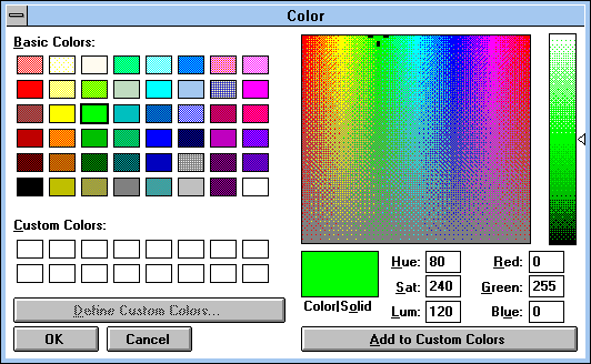
Although a default Palette Bar is shown in the graph window, you may add other colors to this tool. To change any color of the palette bar, double-click any of the colors shown. The left half of the following dialog box will appear:

You may choose any color from this palette and press the OK button; that color will replace the one you clicked on the palette bar. Alternatively, you may click the “Define Custom Colors>>” button to “mix” your own Custom Colors. The right half of the dialog box, containing a “painter’s palette” of the colors of the rainbow, then becomes accessible. Click on a spot in the rainbow, or type new numbers in any box except the “Lum” box, to change the mixture of the three primary lights (red, green and blue). Moving the slider on the right side of the painter’s palette up or down, or typing a new number in any box except the “Lum” or “Sat” boxes, makes the mixture lighter or darker. Your custom color is shown in the box below the painter’s palette. To add it to the palette bar, click “Add to Custom Colors” and then click on the OK button.
Note: The changes made in the palette are not saved unless you use the Export Template command to save your settings (and the Import Template command to recall them).