You can examine the efficient frontier in tabular and graphic form by clicking the View button.
For the excess return efficient frontier, two separate efficient frontiers are calculated and displayed. The first table is the results of the excess return basis efficient frontier with an additional set of information: the nominal (asset) basis return and standard deviation associated with the excess return efficient portfolios. The second table is the results of the nominal (asset) basis efficient frontier, again with an additional set of information: the excess return and standard deviation associated with the nominal (asset) return efficient portfolios. This information is calculated and provided so that the efficient frontier can be viewed and compared on “apples-to-apples” bases, including the familiar nominal (asset) expected return basis.
For details on calculating mean and standard deviations, see the Technical Reference article Efficient Frontier Mean and Std Dev.
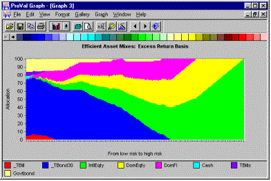
When you graph the output, it will produce the "classic" efficient frontier graph as well as a graph illustrating the percentage of each asset class in each mix on the efficient frontier. On the allocation graph, the colored areas will always fill to the top of the graph, as the total allocation will always be 100%. The amount of any given color vertically represents the allocation to a particular asset class. The horizontal axis represents increasing risk as you move from left to right.

If you are graphing data from an excess return efficient frontier, you will get two sets of graphs: one on the excess return and standard deviation basis and one on the nominal (asset) return and standard deviation basis. Each of the graphs will have a red line illustrating the excess return efficient frontier mixes and a blue line illustrating the nominal (asset) return efficient frontier mixes.
When you look at the asset mix allocation graph for the excess return mixes, you see that the low-risk/low return mixes are commonly made up of long term bonds, whereas when you look at the asset mix allocation graph for the nominal (asset) return mixes, the low risk/low return area is commonly made up of T-Bills.
The efficient frontier can then be used in the Stochastic Assumptions command to select the desired portfolio mixes for analysis.