What do you want to do?
See the data values behind the graph
Insert the graph into another document
How to read a floating bar chart
Create a graph
To create a graph, view output for one of the following and click the Graph button.
- Valuation Output
- Valuation Set Output
- Core Projection Output
- Deterministic Forecast Output
- Stochastic Forecast Output
- Capital Market Simulation Output
- Efficient Frontier Output
- Experience Study Output
For custom output where you pick the variables, runs, years, etc., you'll be able to choose which of these are used for the graph's x-axis and data series. ProVal sets the default by analyzing your output, but you can change them if you wish. If your output includes percentiles, you'll also have the option to use a floating bar chart instead of a bar (or line) chart. See How to read a floating bar chart.
Efficient Frontier and Experience Study graphs are created without need for additional setup.
For valuation output, projected benefit payments will generate a separate graph from the graph for variables (if any).
Customize the graph
To customize these aspects of your graph:
- Titles.
Click the Titles button on the toolbar to change the Main, x-axis, and y-axis titles. Use a caret (^) as a line break between lines, e.g., "first line^second line".
- Chart type.
Click the Bar/Line button on the toolbar to change a bar chart to a line chart, or vice versa.
- Colors.
Click the Colors button on the toolbar to change the color of each series. See Change the Chart Colors.
- Vertical axis scaling.
Click the Scale button on the toolbar to change the minimum and maximum values displayed on the y-axis, as well as the amount between the labels shown (steps).
- Variables, runs, years, percentiles.
Go back and customize your output, then graph it again. See Create a Chart.
- X-axis and series (legend) labels.
Go back and customize your output, then graph it again. See Create a Chart.
See the data values behind the graph
To see data values, you can:
- Hover your mouse over a data point to see a tooltip for a given point.
- Click the Data button to see all data values in the chart.
- Go back to the original output in ProVal.
Change chart colors
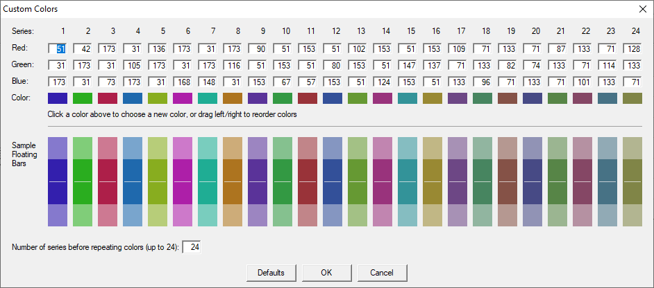
Click the Color button to enter the Custom Colors dialog box.

The defaults have been chosen to a) provide optimal contrast when projecting onto a large screen, b) ensure adjacent Series are well differentiated and c) avoid repeating colors for up to 24 Series. The defaults can be restored using the Defaults button.
You may specify a new color for each series by a) entering Red, Green, Blue (RGB) values or b) clicking the small square "swatch" Color, which then allows for manual/visual selection or entry of HSL values (since some corporate templates use HSL values instead of RGB values).
Note that ProVal automatically lightens the main selected color for the upper and lower sections of the floating bar. Thus, if you specify a light color for the main color (e.g. a Lum value of 150 or higher) ProVal won't be able to lighten it further, and in these cases will darken, rather than lighten, the upper and lower sections of the floating bar. Although there is no accounting for taste, generally you will get the best results with Lum values between 90-110. Finally, if you specify colors with extreme Lum values, ProVal will automatically tweak them.
Your color preferences are saved automatically and will apply to all new graphs you create.
Get data values into Excel
You can get a graph's data values into Excel in several ways:
- Click the Copy button, select Copy Data, and paste it into Excel.
- Click the Data button, then click the Copy button, and paste it into Excel.
- Go back to your original output in ProVal and click the File button.
- Go back to your original output in ProVal, click the Copy button, and paste it into Excel.
Insert the graph into another document
Click the Copy button, select Copy Picture, and paste the graph into your other document (e.g., Microsoft Word, Microsoft PowerPoint).
How to read a floating bar chart
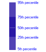
Stochastic results represent a range of outcomes. These are often presented as a “floating bar chart” showing selected percentiles from the range. In the example below, the upper and lower edges of the bar are the 5th and 95th percentile values. The darker shaded region in the middle represents the range from 25th to 75th percentile values. The line drawn within this darker region is the 50th percentile (median) value.

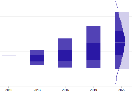
Note that the area of each segment of a “floating bar” is not proportional to the number of trials in the range, the way it would be in a histogram. This can be explained because the bars are a uniform width. If the width of the bar above varied to form a histogram, it might look like this:
