This type of graph is often used in statistical studies (although not often in ProVal studies). It shows columns that vary over a period of time and a cumulative curve indicating the proportion accumulated by each column in the graph. Variations include:
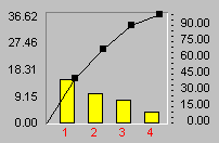
| 2D Pareto: shows the cumulative curve. The percentages are shown to the right of the graph. The points, or data marks, may be shown on the graph.The Point Markers can be turned on or off by means of the Series Tab of Graph (or Chart) Properties.The Point Type (e.g., circle, rectangle) and Point Size are set on the General Tab of Graph (or Chart) Properties. |  |
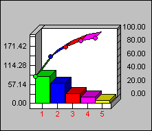
| 3D Pareto: This is the same as 2D, but the graph is three-dimensional.3D is activated on the 3D View Tab of Graph (or Chart) Properties. |  |
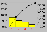
| 2D Pareto Joined: This is the same as 2D Pareto, but the series appear together with no spaces between them. Setting the Marker Volume at 100% will join all series together.The Marker Volume is set on the General Tab of Graph (or Chart) Properties.Note: Bars are not sorted automatically. |  |
These graphs support special 3D effects, Zoom In and rotation capabilities.