This is a point graph that shows the relationship, or degree of relationship, among numeric values of several series. Two series of data, represented on the graph as groups of numbers, are plotted as one set of x-y coordinates. The scatter graph’s main use in ProVal is for displaying the efficient frontier.
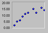
| 2D Scatter: shows the relationship, or degree of relationship, among numeric values of several series. Two series, or groups of numbers, are plotted as one set of x-y coordinates.The Point Type (e.g., circle, rectangle) and Point Size are set on the General Tab of Graph (or Chart) Properties. |  |
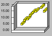
| 3D Scatter: This is the same as 2D scatter, but the points are shown as 3D cubes.3D is activated on the 3D View Tab of Graph (or Chart) Properties.Although there is a choice of point types for a 2D scatter graph, the Point Type must be set to <cube> (on the General Tab of Graph, or Chart, Properties) for a 3D scatter graph. |  |
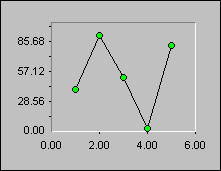
| Scatter with lines: Scatter graphs can also be shown with lines connecting the x-y coordinates. You may choose whether to show the points of the x-y coordinates.The Point Markers can be turned on or off by means of the Series Tab of Graph (or Chart) Properties.The Connecting Lines option can be turned on or off by means of the Series Tab. |  |
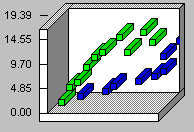
| 3D Clustered Scatter: This is the same as 3D Scatter, except each series is positioned in a different row.The 3D Cluster option is set on the General Tab of Graph (or Chart) Properties.3D is activated, however, on the 3D View Tab of Graph (or Chart) Properties.Note: Clustering works only if you have the 3D view turned on. |  |
These graphs support special 3D effects, Zoom In and rotation capabilities.